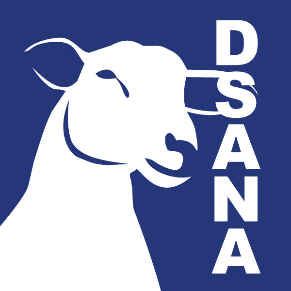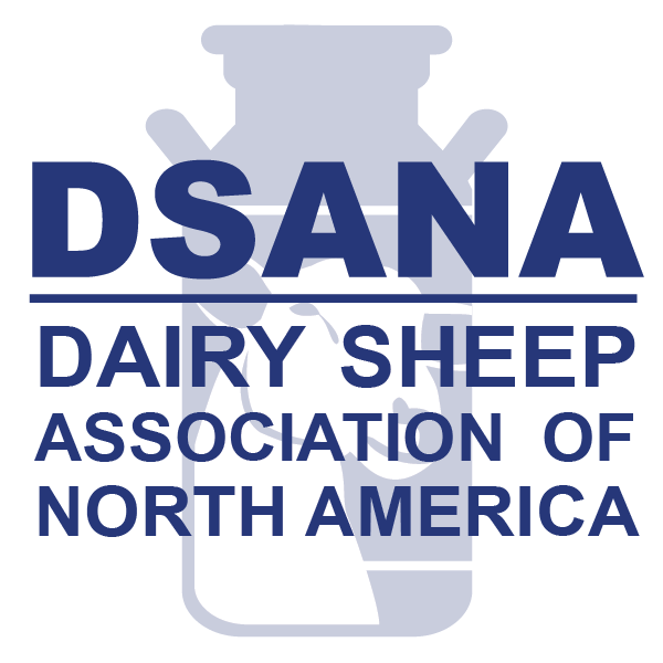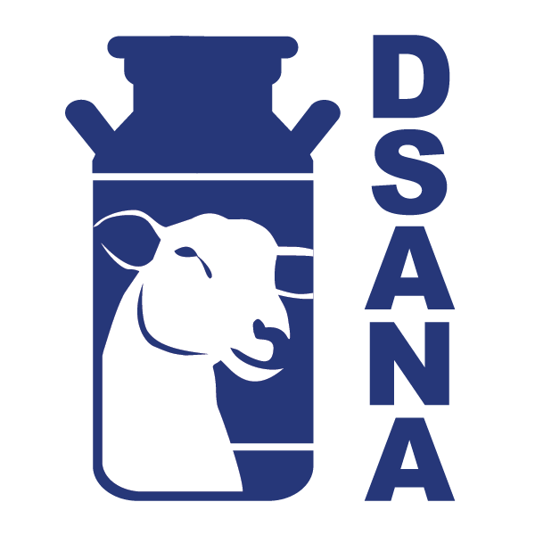

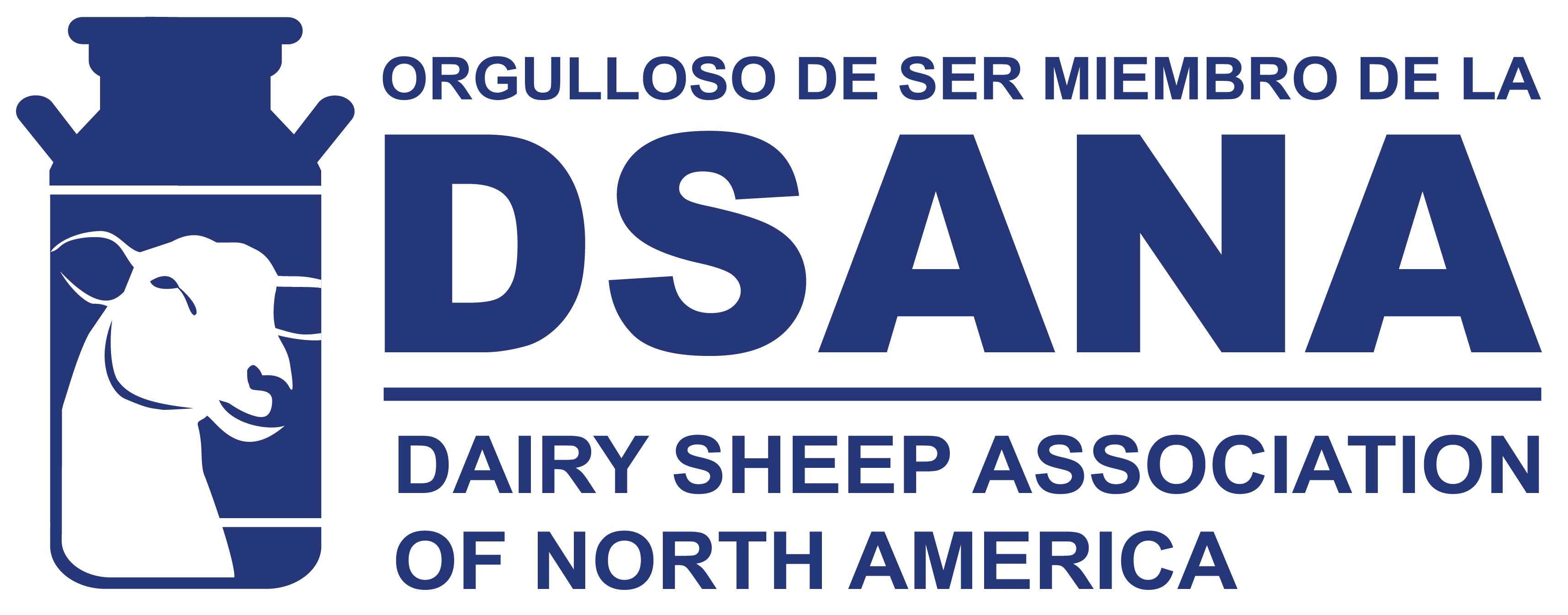
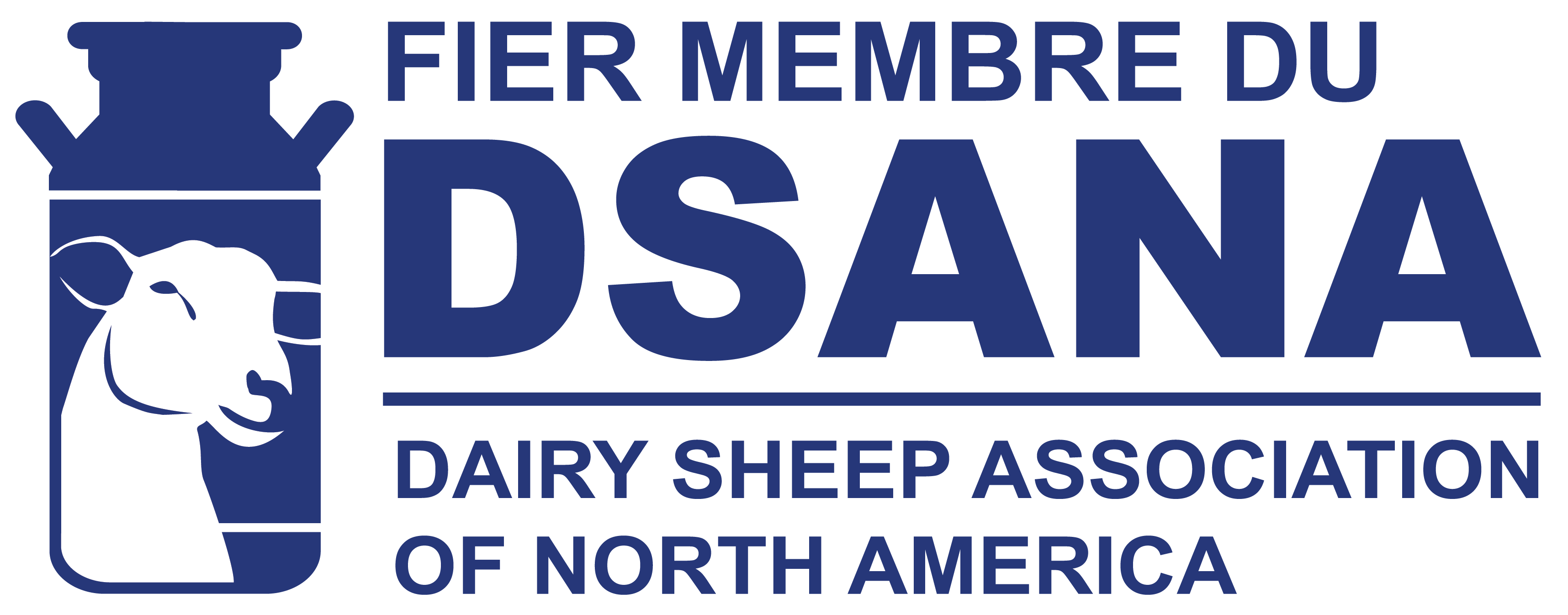
DSANA wanted a logo that was strong, bold, blue, and included an image of a dairy sheep. They wanted the logo to be inclusive and represent each of the many products produced by dairy sheep (milk, cheese, yogurt, etc.) so dairy sheep farms across North America could connect and embrace the brand. The image of a milk can, as well as the head of a dairy sheep, combined with a simple font created the desired effect.
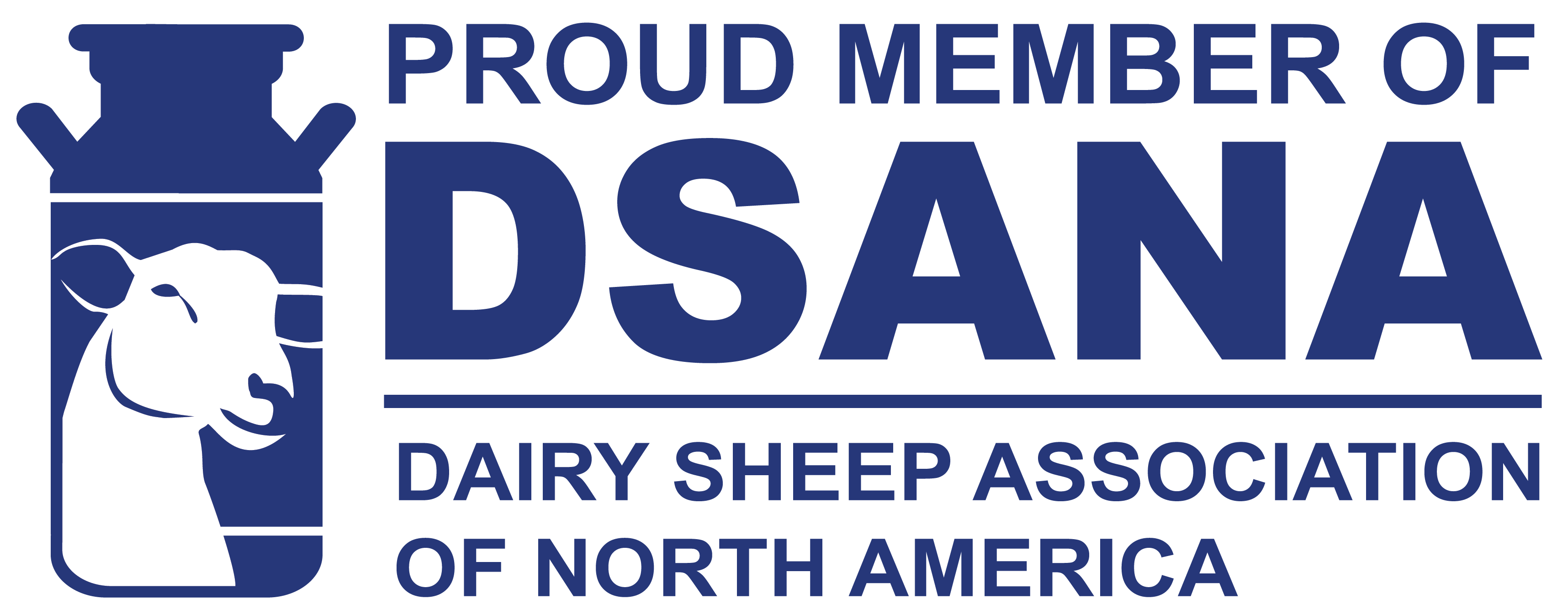
The logo was added to the newly revamped website, on printed materials, and used to create decals in three languages (English, French, and Latin American Spanish) to give to members across North America to proudly display at their farms.
Finally, several social media icons were discussed and approved for use by DSANA and their members.